Webpage: NCT
NCT (Neo Culture Technology) has been my favorite artist since middle school. As the group approaches their 10-year anniversary, I wanted to create a one-page informational site to breakdown the group’s journey over the past decade. Known for being the largest group in K-pop with 24 active members, the group’s wide discography and unique concept is both alluring and confusing. This site aims to showcase the many colors of NCT and explain the group’s Neo concept both in text and visually. The Figma prototype features interactive elements to showcase the different members of the group, as well as a scrollable timeline showcasing their discography.

Process & Details
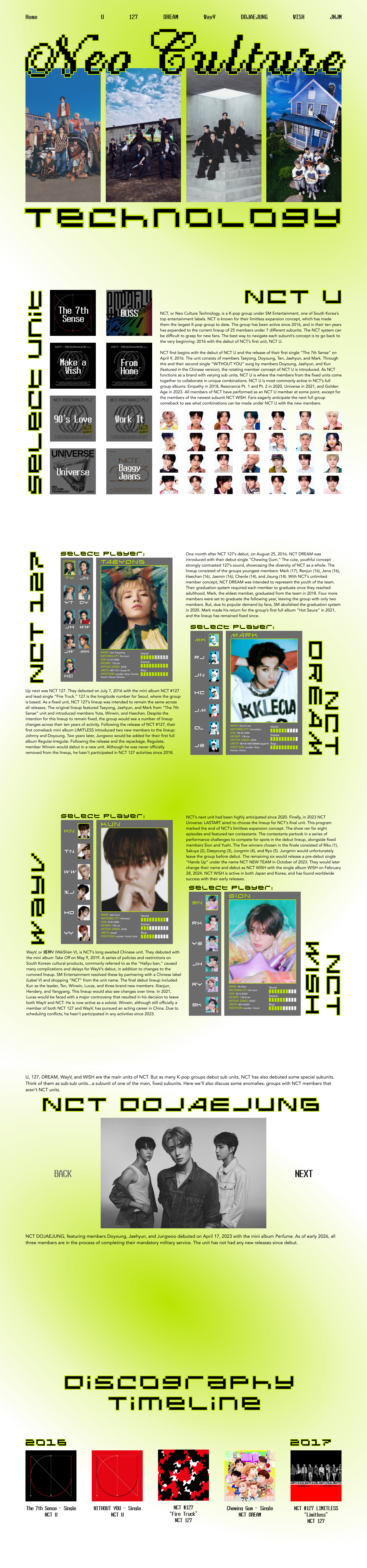
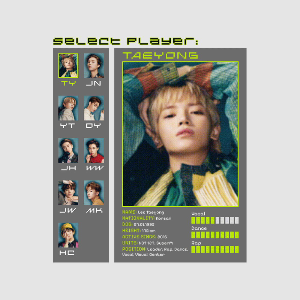
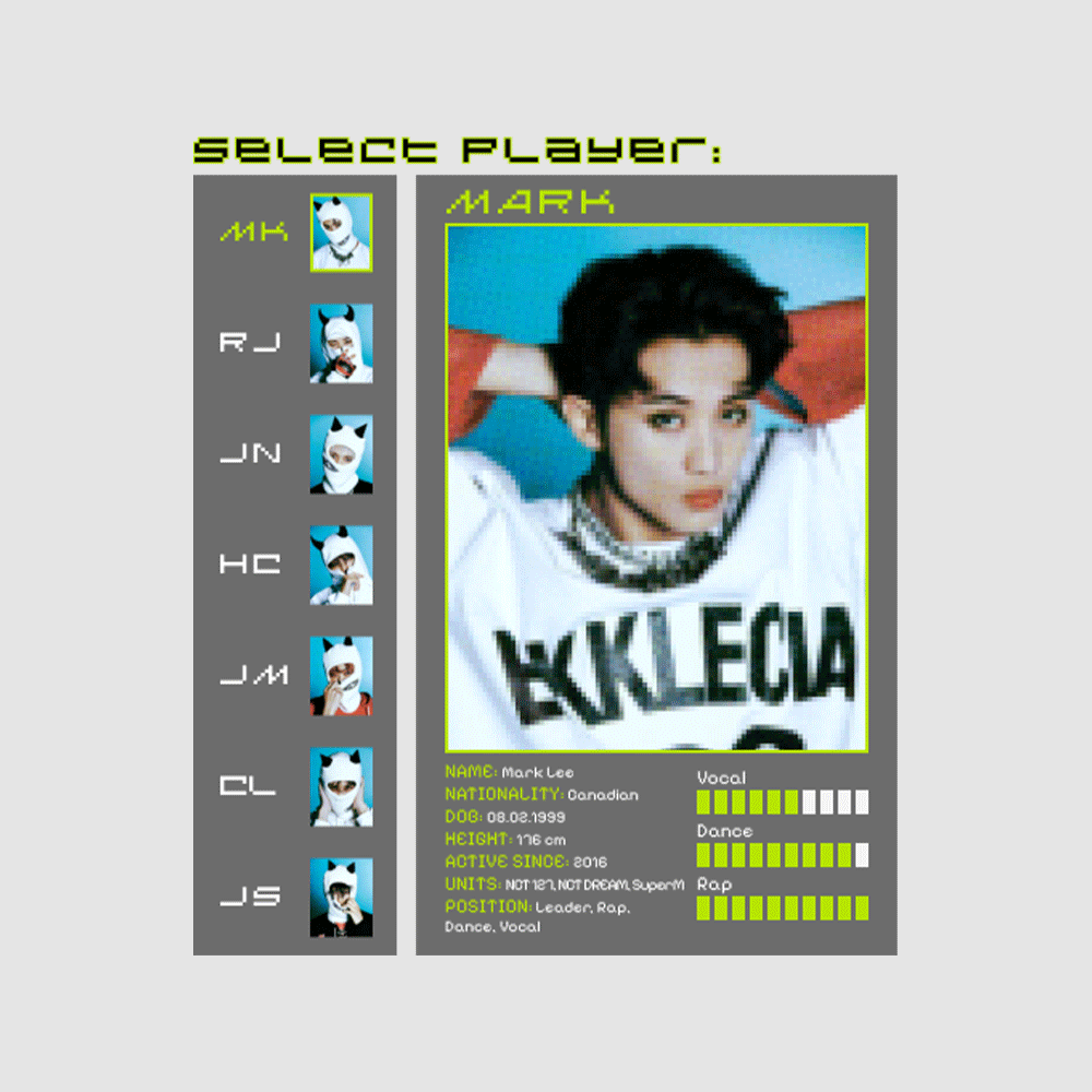
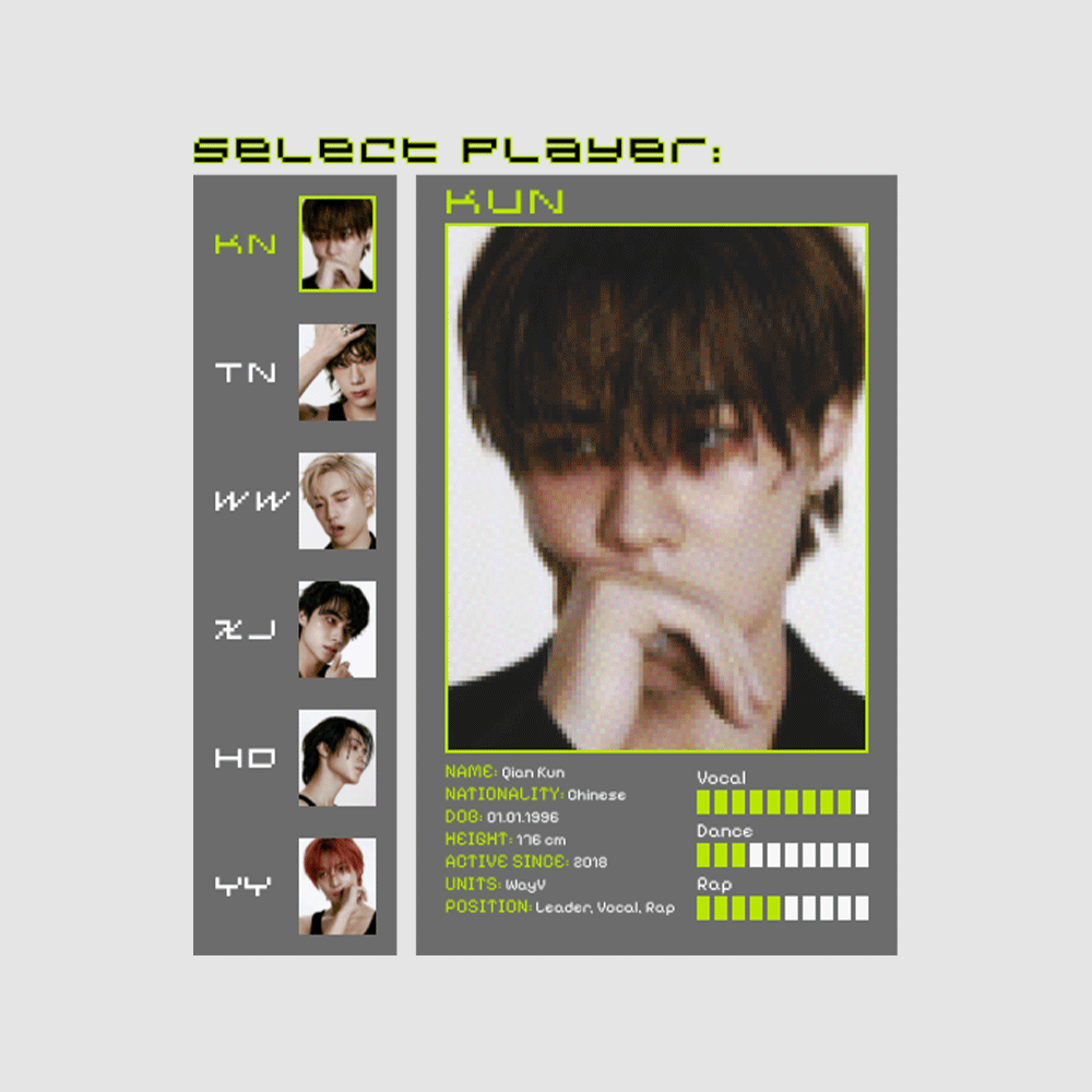
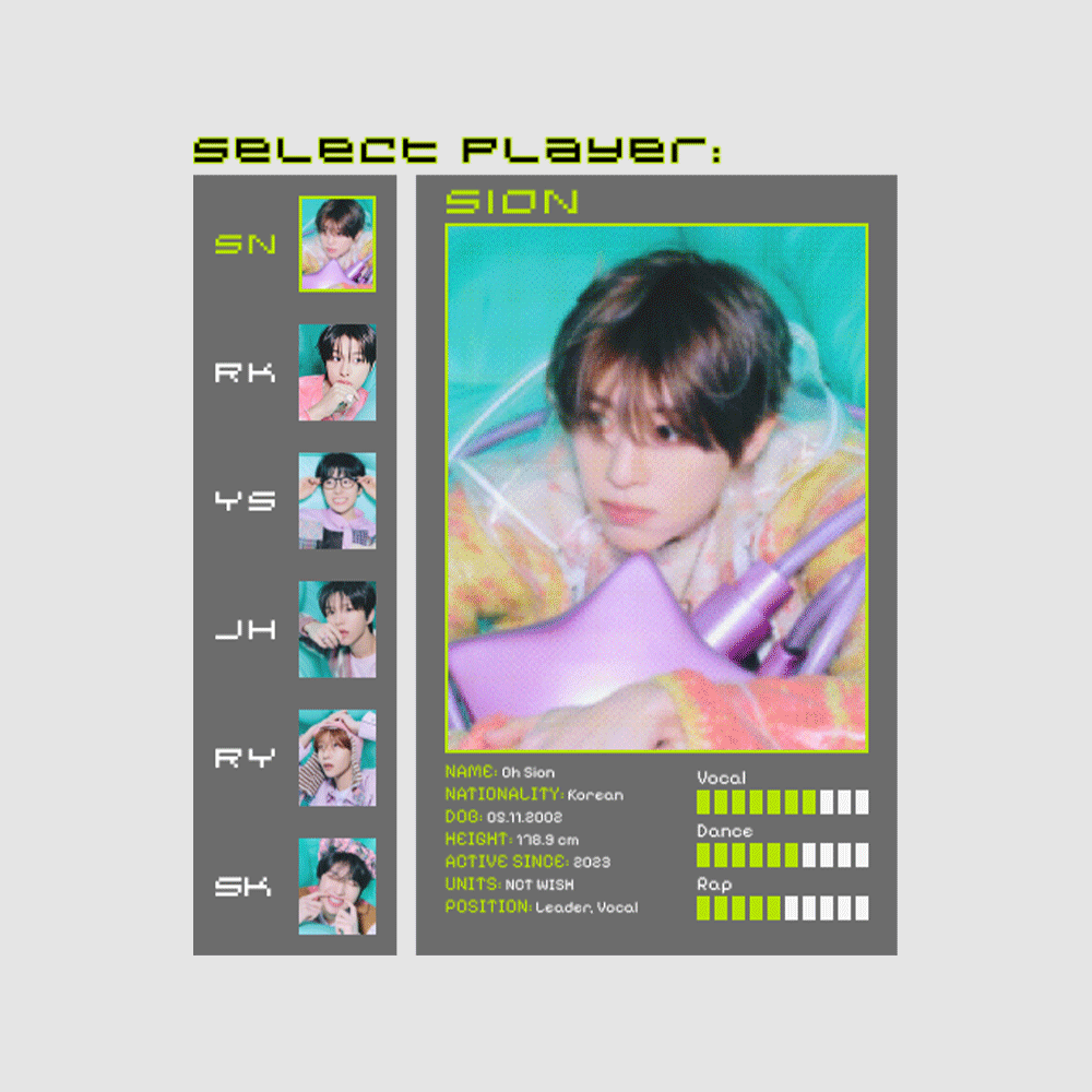
NCT is most known for two things: their limitless number of members and their funky, “Neo” style represented by their brand’ signature bright green known as “neo pearl champagne.” The group is divided into four main subunits (it’s more complicated than this, but the site explains it all!): NCT 127, NCT DREAM, WayV, and NCT WISH. Each of these subunits differs greatly in their lineup and concept. I knew it would be a challenge to incorporate the sensual concept of WayV and the adorable aesthetic of NCT WISH into the same design. As far as the color palette, I chose to keep it simple and utilize the “pearl neo champagne” associated with all the units of NCT. I used a pixelated, video game style for the typography and certain graphic elements, as this is a concept used in quite a few songs (see NCT DREAM’s “Arcade,” NCT WISH’s “CHEAT CODE,” and NCT 127’s “Punch.”), and I felt it captured the “technological” aspect of NCT’s brand and sound. This style enabled me to create player menus that you might see in a video game. This was a fun way to visually represent the lineups for each of the units, as well as adding an interactive feature to the site.