Information Graphic: Fruitrition Facts
Adobe InDesign, Adobe Illustrator
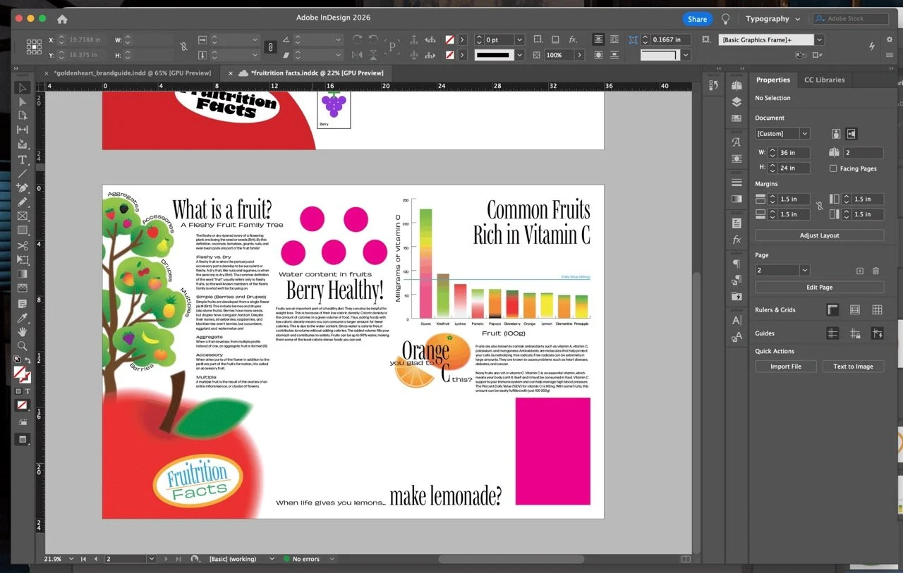
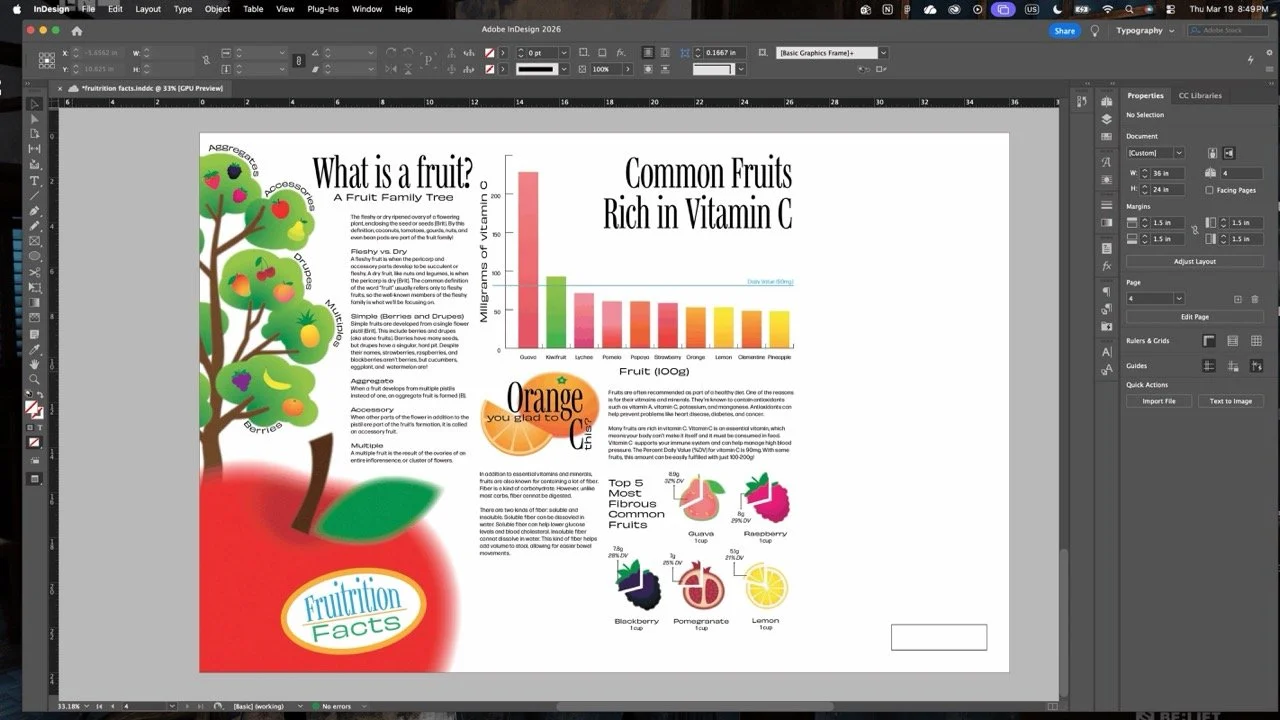
“Fruitrition Facts” (Fruit + nutrition facts) is an infographic poster discussing the role of fruit in a healthy diet. Nutrition can be a confusing topic as people are constantly fed misinformation and targeted by those aiming to capitalize on health and body insecurities. Everyone always talks about what’s bad for you and what not to eat. Because of this negativity, many people are misled into thinking healthy and delicious are mutually exclusive. With “Fruitrition Facts,” I wanted to explore the topic of nutrition in a positive way by showing people one of the yummiest, healthiest foods given to us by nature: fruit! This infographic only scratches the surface of the broad topic of nutrition, but I wanted to give people a slice of basic information surrounding the nutritional value of fruits and how to maximize their benefits.

Details
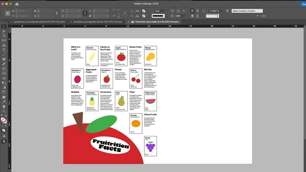
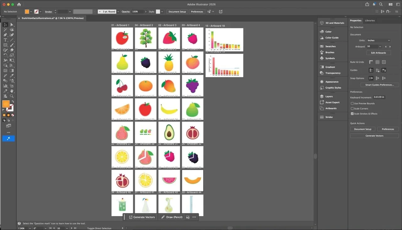
I was most excited about creating the illustrations for this piece. I wanted to highlight the vibrant variety of colors seen in different fruits. In order to achieve this, I knew it was important to focus on contrast. I kept the information structured and concise. True black was used for text and true white for the background. The natural forms of the fruits and their flashy colors would serve as a visually enticing element to give viewers a break from heavy blocks of text and keep them engaged. I used each color in its highest saturation to maximize its bright and vibrant energy. The illustrations were made using various shapes combined with gradients and layered grain, noise, and blurring effects. My favorite illustrations are the beakers in the rightmost column. Accompanied by a section discussing chemical reactions occurring within fruits during different food preparation processes, the beakers are used as glasses for popular fruity drinks: lemonade, melon soda, and a piña colada.


Process
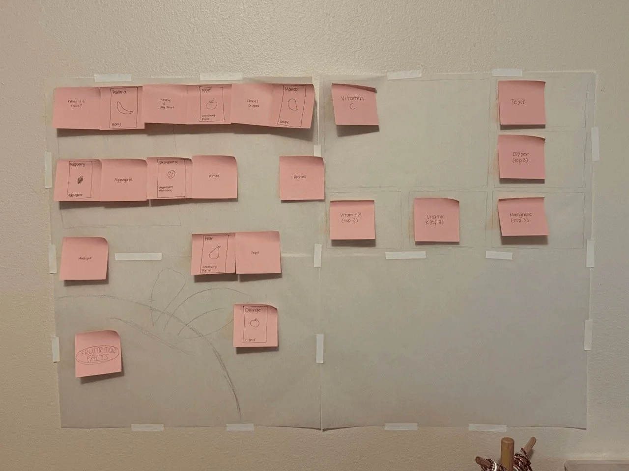
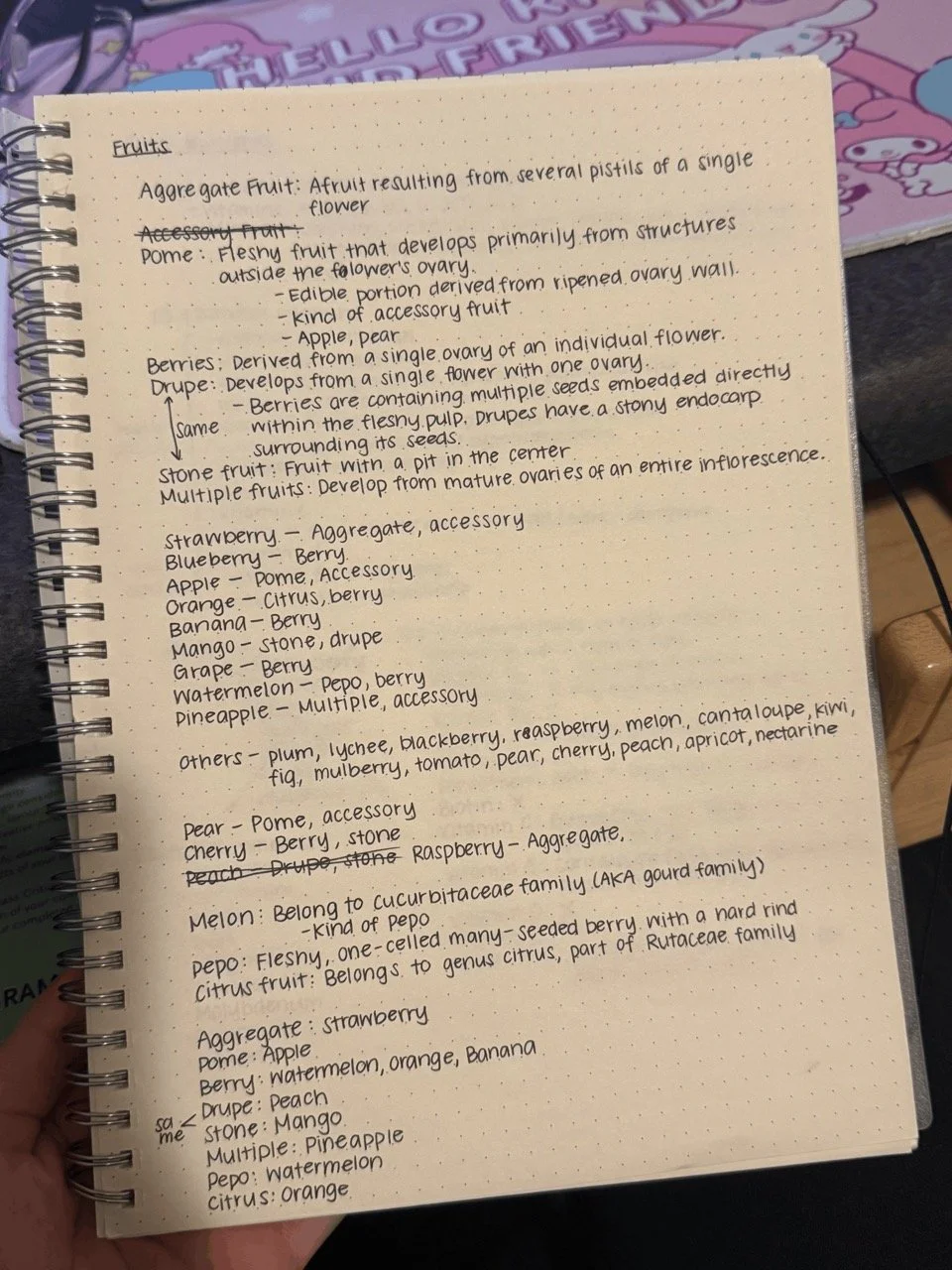
In order to tackle such a large poster size, I returned to an analog method of planning. While I usually use my iPad for most of my sketching and ideation processes, I went back to pencil and paper for this project. I pieced together a 24”×36” map on tracing paper to sketch and plan where the graphics and text would be placed. This helped me visualize the real size of the poster. I wrote down my research in my notebook as I collected data, then began designing. There is an empty space in the bottom right corner of my original layout plan—partly I wasn’t certain how much space the text would require. Another reason was that my process is almost never straightforward. I like to sketch out the bones of my design so I can better visualize the final product, but a lot of my ideas come in the middle of my process. I wanted to leave some space open for new ideas. I started with basic shapes to substitute illustrations so I wouldn’t end up creating things I’d later have to delete. But even as I started piecing together my final draft, a lot of things moved around and new things were added. For example, The “fruit family tree” only came to me as I started working on the final draft.